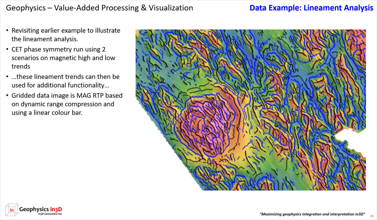
Assessment of geophysical data is maximized when experimenting with multiple colour distributions. Histogram or equal area distributions are very helpful at displaying variation across a data set. However, linear distributions enable the observer to compare and contrast different responses. In the image below the total magnetic intensity (TMI) data are compared using histogram and linear colour distributions.
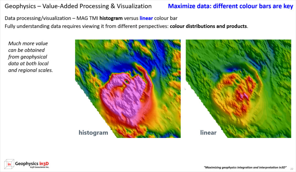
In the next image the TMI magnetic data (histogram) are compared with the total gradient amplitude (TGA) using a linear colour bar. The TGA (also known as analytic signal, ASIG) minimizes long wavelength/deep-seeded features focusing our attention on the near surface responses. The total gradient simplifies the magnetic picture, removing complications from magnetic remanence and magnetic inclination and declination. Two magnetic domains are easily seen in the TGA data.
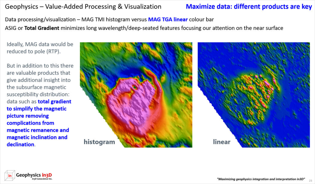
When studying the structural fabric and magnetic domains of survey data the total horizontal derivative (THDR) is very helpful grid product. In the image below the TMI magnetic data (histogram) is compared with the THDR using a linear colour bar. The THDR grid clearly shows two magnetic domains within the overall intrusive feature. This observation is not as obvious in the histogram coloured TMI data.
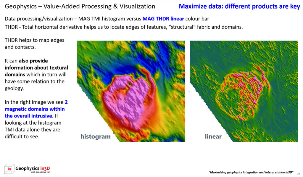
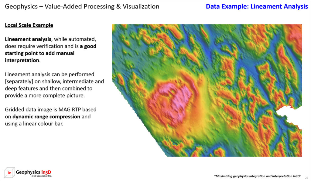
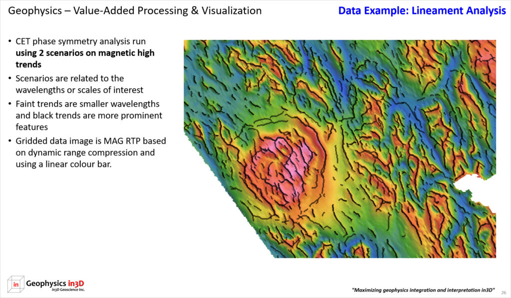
Lineament analysis using phase symmetry was performed on the magnetic high and low trends. This is a good starting point for structural interpretation. Manual interpretation of lineaments would follow to ensure that important contrasts are not missed. The data in this image is the RTP (reduced to pole) magnetic data. Magnetic data can be difficult to display using a linear colour bar. In this case the data were processed using the CET dynamic range compression algorithm.
Lineament analysis performed on a RTP magnetic high trends at two sets of scales.
Lineament analysis performed on a RTP magnetic low trends at two sets of scales. Magnetic low trends are often associated with faults and contacts.

Lineament analysis performed on a RTP magnetic high and low trends at two sets of scales. This is the final image of the lineament analysis. Lineament analysis generally needs to be conducted at multiple scales in order to map narrow and wide trends. This analysis would then be reviewed to see if additional trends can be manually interpreted. For example, a discontinuity may not be mapped by either high or low trends, but can be interpreted by clear offsets in the data.


