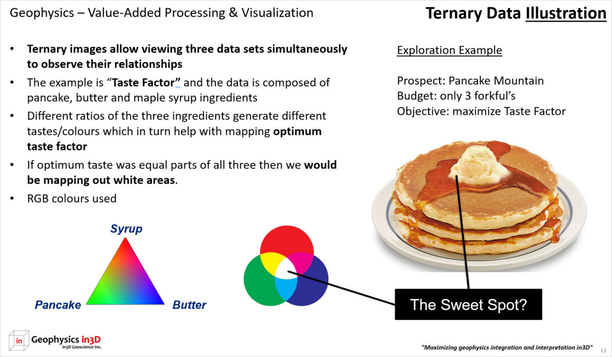
Data visualization is a lot more than choosing a colour bar. Specific aspects of the data may require multiple passes of different visualization or filtering techniques to bring out the range of features present in a data set. Ternary images are very useful with geophysical data. In this presentation example, the data sweet spot or target of interest is illustrated using pancakes. The audience had little familiarity with geology or geophysics. The image shows how we would look or “taste” for the ideal taste factor. Of course this is not straightforward as personal preference adds another element. However, we could envision 60% pancake, 30% maple syrup and 10% butter. If we were plotting this data in colour, a ternary image would help us locate the specific colour of interest.

